%20(1).png)

Becoming MKT Photography
- mktphotography
- Dec 3, 2019
- 3 min read

Starting from the beginning, around 2014 “Turner Photography” was created and in 2019 I was tasked with a rebranding and because turner photography on google searches popped up with 244,000,000 results while MKT photography had a lower amount at only 27,800,000 results. And since as of right now I am based in Richmond, Va; I searched each name followed by my location and “Turner Photography” was in the millions while “MKT Photography” only resulted in tens of thousands. Therefore, MKT Photography was the winner, to now become my new brand.
To develop my online portfolio with more functionality and aesthetic I started with my logo. With the logo I wanted to solidify my color scheme, font type and important features. I started with a few muted colors. I wanted to cut it down to a primary and secondary color. After asking multiple people’s opinions and deciding what I wanted to convey my brand as, I decided on pink and green. They are complementary, therefore, they work well to enhance one another. Once I had decided on these colors, I wanted to make sure that the use of pink would not turn off males to my page, however, the majority of engaged people tasked with looking for a photographer is predominantly the bride. It is not bad if it attracts females with this research. As well as attracting brides, pink was chosen to complement the idea of romanticism. Green put a bit of a more natural and masculine feel to the logo and brand. It led to the idea of more organic detail which started off as flowers and now they are leaves. The design of the polyagle shape derived from the look of a traditional diamond shape. The angular background works well surrounded by the organic overlayed leaves.


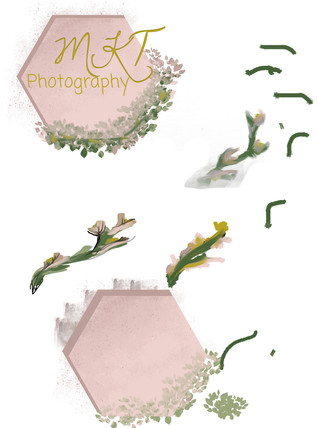
The font of the logo has multiple different aspects from three different font families, “Dawning of a New Day” was used at the M and K while “calligraphy” was used for the T because the T did not seem to fit the rest. A serif font was used for the word “photography” for a more professional addition beside a lot of color. Since the logo is not very minimal the website itself was to be not very decorative other than the important pictures. The minimalist style is carried out on each page. This lettering is carried throughout as a personal symbol, such as on documents like my resume.

I was told that the leaves may be too cluttered and to consider taking them off. After consideration, I decided to keep them in place but just take down the opacity some more. I did this because that is the part of my logo that represents me the most. I am a romantic, I mean how could you not be in the wedding industry, as well as, flowers are very meaningful in my life. Since I was a kid, I have saved every single flower I have gotten, they are dried and in a box, flowers from dances, funerals and many other events. They are a beautiful recall of an important day for me. Now as I have grown, I even have tattoos of many flowers, one from every country I have visited because they represent my travels in a beautiful and meaningful way. Because of the meaning flowers have had in my life, I could not bring myself to erase this part of my brand.
Once I have my logo finalized, I was able to create marketing devices such as business cards and poster mock-ups. I wanted this to stay minimal as well with only an example of my work and mandatories such as my phone number, website, email and my logo of course. To keep it as minimal as possible, I made them front and back.


Finally, I went to work on my website, starting with simplifying and modernizing. I match color schemes and made each page match one another. I made the navigator more simple design wise. I wanted to make it more clean looking to navigate between each page; weddings, families and senior pictures. My gallery is now easier to navigate so that it doesn’t take up the whole home page. The home page is now more than just a gallery but gives information about me and how to contact me. I changed my url and paid for a personal one. As Turner Photography my url was turnerphotography000.wixsite.com/photography and now as MKT Photography it is mktphotography.org.
Overall, I am very happy with how my rebrand turned out and every decision I made to get there. The goal of this was to get more viewership and interest in my site.


Comments